Query & Analysis Tools
This section explains the features of the query rectangle, a tool to select a region of a plot and reports statistics for the data inside it: minimum, maximum, mean, FFT, rise time and more. The query rectangle was intended to speed up data analysis for quick, one-off measurements!
Looking for a persistent overlay instead?
The query rectangle is a one-off measurement. For a rise/settling or FFT readout that stays on the subplot with draggable window lines, see Analysis Modules, which use the same NER and FFT calculations described below.
Creating a Query Rectangle
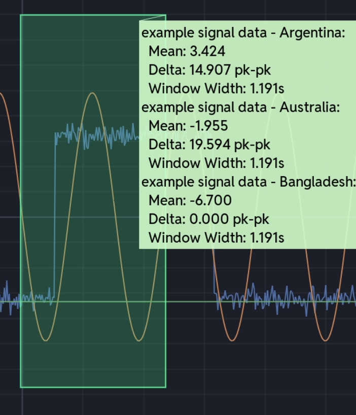
Ctrl+drag in any subplot to draw the selection, shown as a green overlay. Release the mouse and a tooltip lists the statistics for every visible series inside the rectangle. Middle-click and drag does the same thing.
Adjusting the Rectangle
The rectangle has handles once drawn:
- Corners - drag to resize in both directions
- Edges - drag to resize in one direction
- Interior - drag to move the whole rectangle
Statistics are recalculated each time you release the mouse. Each subplot holds one rectangle, so drawing a new one replaces the last.
Statistics
Results appear in a tooltip anchored to a corner of the rectangle, with a section for each visible series inside it.
Basic Statistics
| Statistic | Description | Default |
|---|---|---|
| Mean | Average value | On |
| Delta | Peak-to-peak, maximum minus minimum | On |
| Min | Minimum value | Off |
| Max | Maximum value | Off |
| Std | Standard deviation | Off |
| Count | Number of data points | Off |
Window Measurements
| Statistic | Description | Default |
|---|---|---|
| Window Width | Time span between the first and last data point in the window, in seconds. Not the rectangle's own width, but the data inside it | On |
| Window Frequency | 1 / Window Width, in Hz. Same caveat: based on the data inside the window, not its edges | Off |
Signal Analysis
| Statistic | Description | Default |
|---|---|---|
| Ramp Rate | End-to-end rate of change across the window: (last value − first value) / (last time − first time), in units per second | Off |
| RMS | Root mean square of the values in the window: √(mean(y²)) | Off |
| FFT Analysis | Runs a Hann-windowed FFT on the window and reports the dominant frequency, refined by parabolic interpolation. Shown in the tooltip as "Dominant Freq" | Off |
Power Systems Metrics (NER)
Two variants of the NER standard are available: NER 233, the older one, which measures against the maximum change, and NER 234+, the current one, which measures against the sustained change.
| Statistic | Description | Default |
|---|---|---|
| Rise Time (NER 233) | Time to go from 10% to 90% of the maximum change | Off |
| Rise Time (NER 234+) | Time to go from 10% to 90% of the sustained change | Off |
| Recovery Time | Time to recover to within 95% of the post-disturbance value | Off |
| Settling Time (NER 233) | Time to settle within a 10% tolerance band. See the note below | Off |
| Settling Time (NER 234+) | Time to settle within 10% of the sustained change | Off |
| Damping Ratio | Oscillation damping, calculated by the matrix pencil method | Off |
NER 233 vs NER 234+
NER 234+ always measures against the sustained change (final value minus initial value) for both rise time and settling time.
NER 233 uses the maximum excursion, overshoot included, for rise time. For settling time it takes whichever is larger, the maximum excursion or the sustained change, so a large overshoot widens the tolerance band.
How Cute Plot calculates the sustained change
NER defines this as the mean post-disturbance value, which is subjective if the signal hasn't fully settled. Cute Plot uses the window's End value instead, so place it using your engineering judgement.
Configuring Which Statistics to Show
Open Settings → Query Options. Each statistic can be switched on or off independently, and only those switched on appear in the tooltip. Hover a checkbox for a tooltip explaining exactly what it calculates.
How Results are Displayed
When you release the mouse after drawing or adjusting a rectangle, Cute Plot:
- finds every visible series inside the rectangle
- filters each one to the rectangle's time and value bounds
- calculates the statistics you have switched on
- shows the results in a green tooltip at the corner of the rectangle, grouped by series
Adjusting the rectangle or drawing a new one replaces the tooltip.
Multi-Series Analysis
Each series inside the rectangle is analysed on its own, and the results are grouped by series name, so you can compare several signals over the same time window side by side.