Quick Start
This guide takes you through one full session: loading data, plotting signals, measuring values and annotating what you find.
If you think that any of the steps in this guide could be clearer, reach out at support@cuteplot.com.
Open Cute Plot
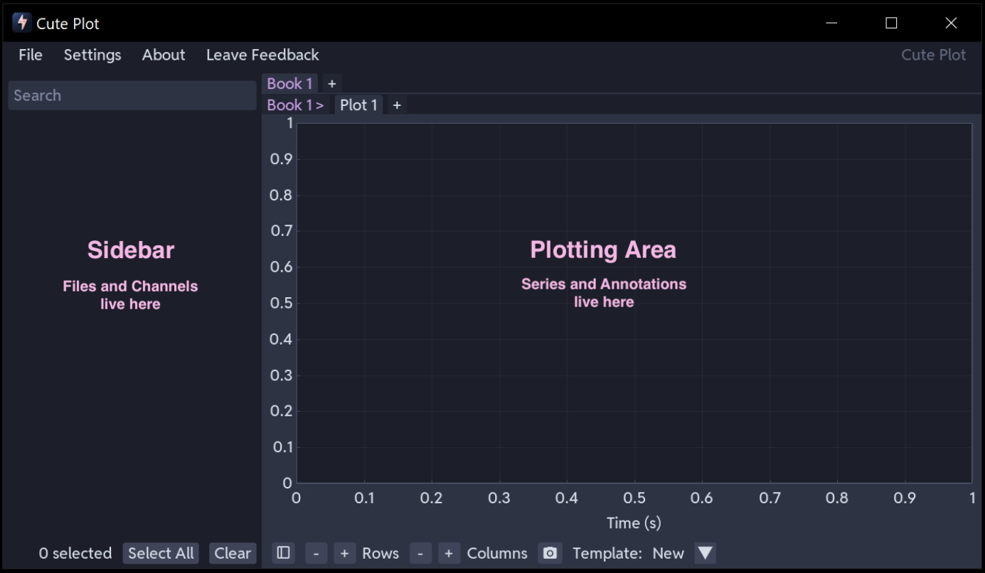
Launch Cute Plot from the Start menu. You will see an empty workspace, with the sidebar on the left and the plot area on the right.
Load a file
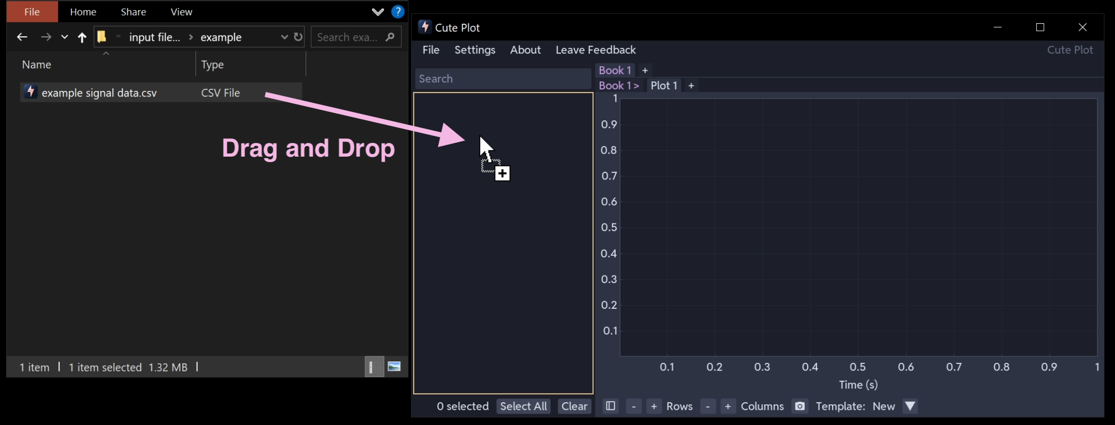
Drag a CSV file from your file explorer into the Cute Plot window. It appears in the sidebar immediately.
Need a CSV file?
Download the example file used in this guide: example signal data.csv
You can also use File → Open to browse for files. Cute Plot reads CSV, Excel, Parquet, PSCAD and PSS/E files, among others. See Supported File Formats.
Browse your signals
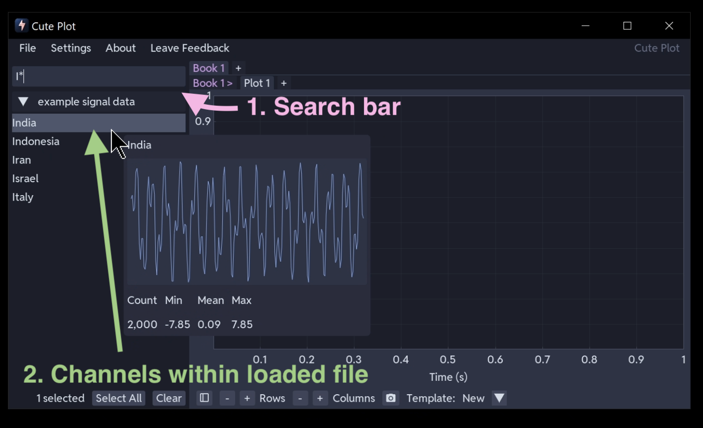
Click the file in the sidebar to expand it. Its data columns, or series, are listed underneath.
Hover over a series to see a preview of its data and a summary of its values.
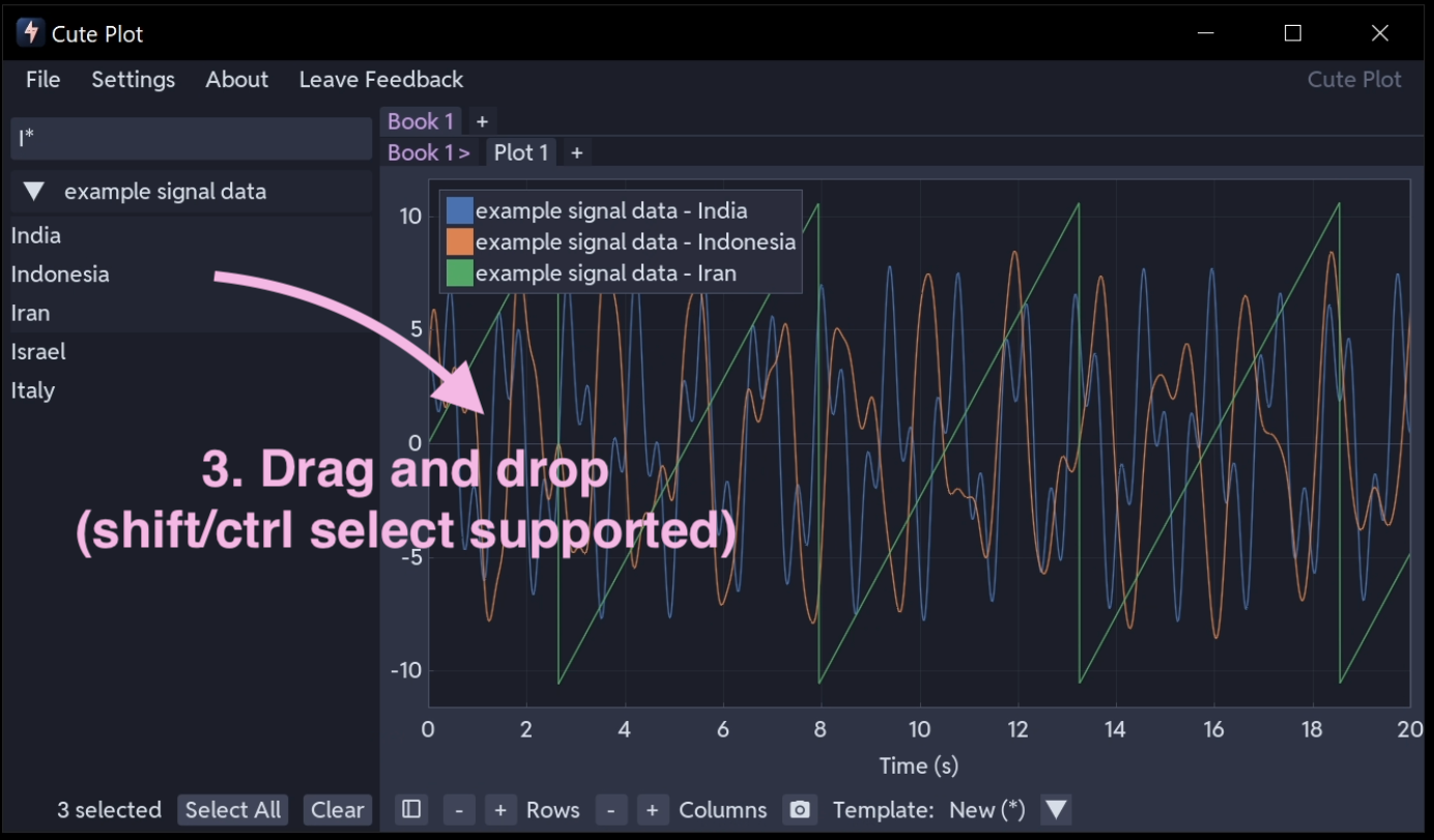
If the file has many columns, filter them by typing in the search bar at the top of the sidebar. Typing I*, for example, shows only the series whose names begin with I. See Search Function for the full syntax, including wildcards and boolean logic.
Plot signals
Select one or more series in the sidebar, using Ctrl+click or Shift+click to select several, then drag them onto the plot area. They appear as coloured lines.
To organise your view, use the Rows and Columns steppers at the bottom of the plot area to build a subplot grid of up to 5 rows by 3 columns. Dragging different series into different subplots keeps the layout readable. See Plotting & Navigation.
Press the sidebar button in the bottom left corner to hide the sidebar.
Navigate your data
With the mouse over the plot area:
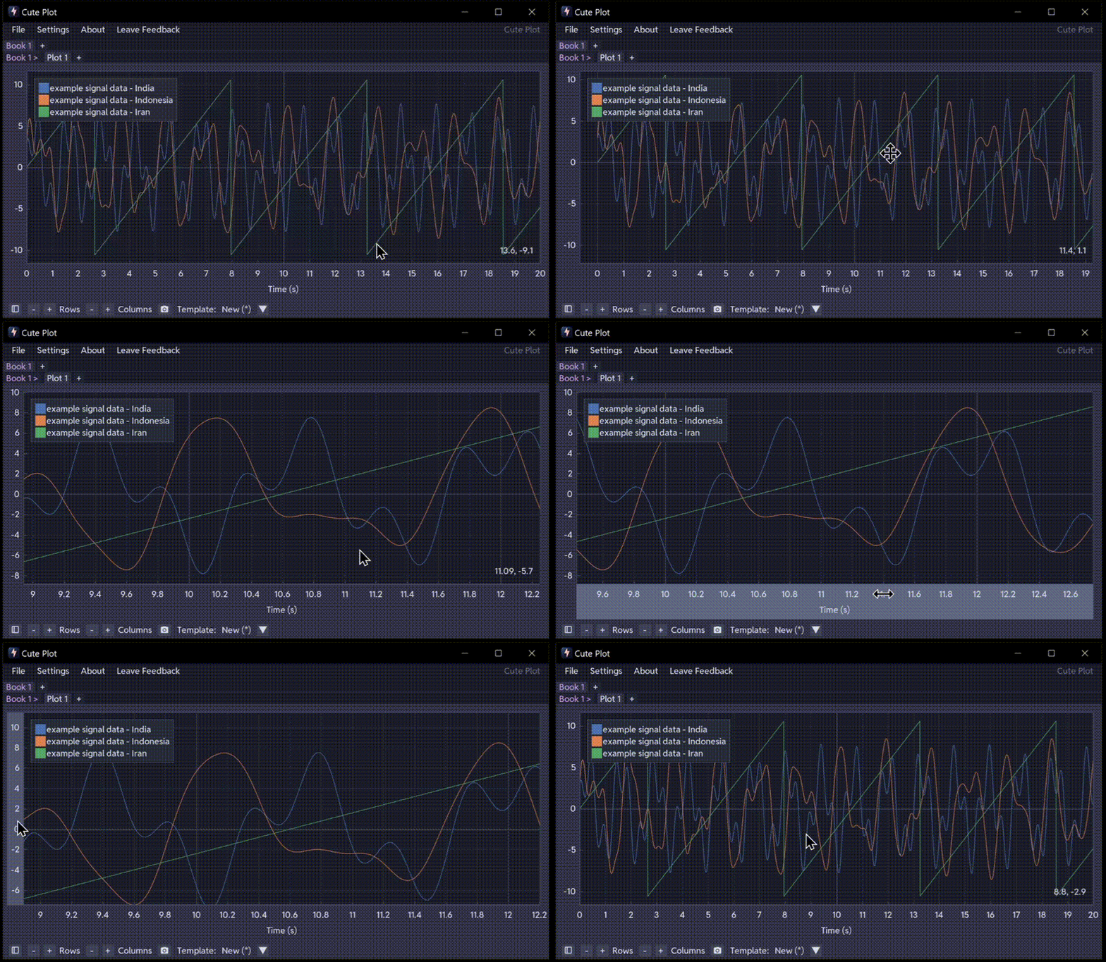
- Scroll the wheel to zoom in and out at the cursor
- Left-click and drag to pan
- Right-click and drag to draw a zoom rectangle
- Double-click to fit all data in view
Hovering over an axis locks the opposite axis, so you can zoom in time alone or in amplitude alone. The same applies when dragging.
Measure values
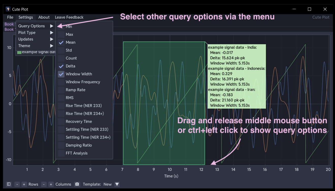
Hold Ctrl and drag in the plot (or hold the middle mouse button and drag) to draw a query rectangle. Release the mouse and a popup shows the minimum, maximum, mean, standard deviation and more for every series inside the rectangle.
Drag the rectangle's corners or edges to resize it, or its interior to move it. The statistics update as you go.
Turn on further calculations, such as RMS, rise time and FFT, in Settings → Query Options. See Query & Analysis Tools for the full list.
Add annotations
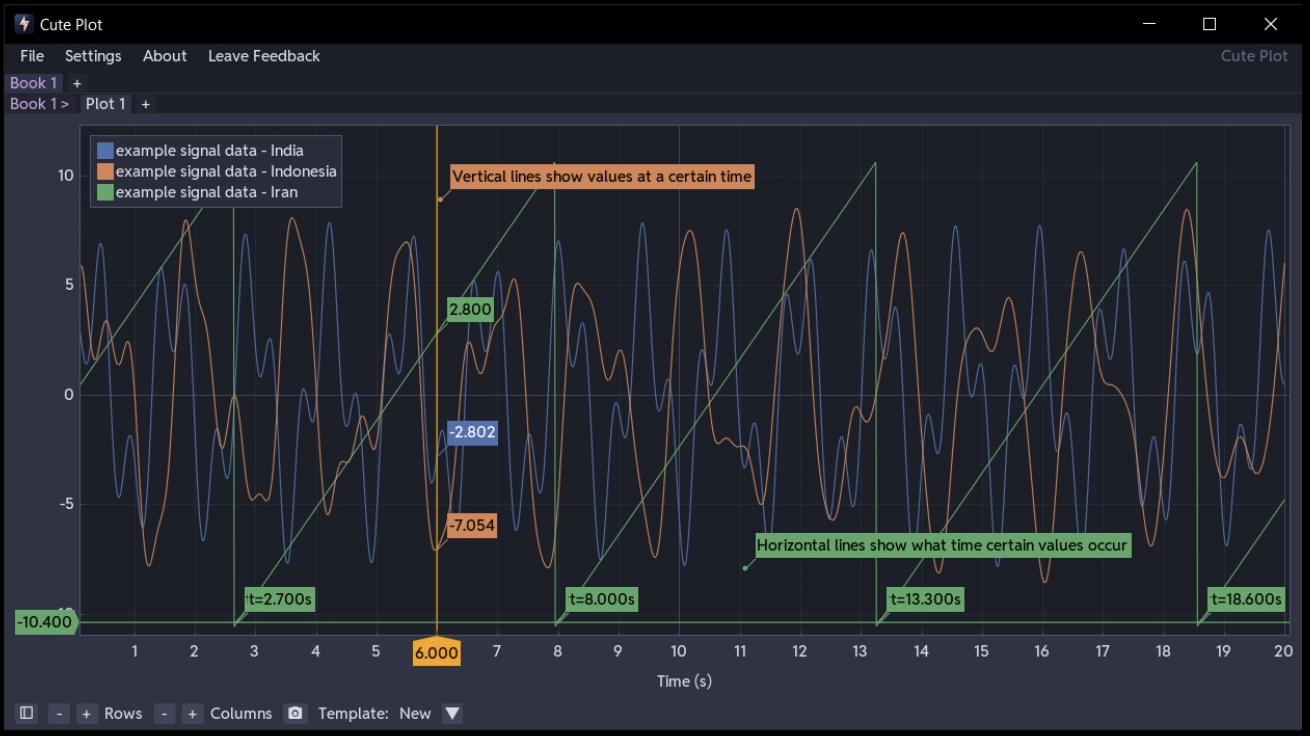
Right-click in any subplot and choose Add Annotations to mark up your plot:
- Horizontal line - a threshold or reference level, such as the 1.1 pu FRT activation voltage
- Vertical line - a moment in time, such as fault initiation at t = 1.0 s
- Linked vertical line - the same moment marked in every subplot at once; drag one line and the rest follow
- Draggable text label - a note placed anywhere on the plot
Drag any annotation to reposition it. See Annotations.
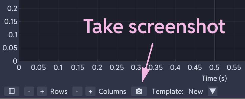
Take a screenshot
Click Take Screenshot in the plot controls at the bottom to capture the current view. Screenshots are saved as timestamped PNG files and copied to the clipboard.