Plotting & Navigation
Cute Plot features a fast plotting UI designed for speed and flexibility. Lots of work has been done to allow for millions of points to be active at once, without dipping below 60 FPS. Panning, zooming and manipulating data is real-time, utilising techniques from video games and GPU rendering to make navigating data-sets seamless, and enjoyable.
At its core, the plot area is a grid of subplots with synchronised X-axes, supporting zoom, pan, annotations and analysis tools.
Subplot Grid
Each plot tab contains a grid of subplots. Use the Rows (1-5) and Columns (1-3) steppers at the bottom of the plot area to resize the grid. Adding or removing rows and columns does not clear the series already plotted.
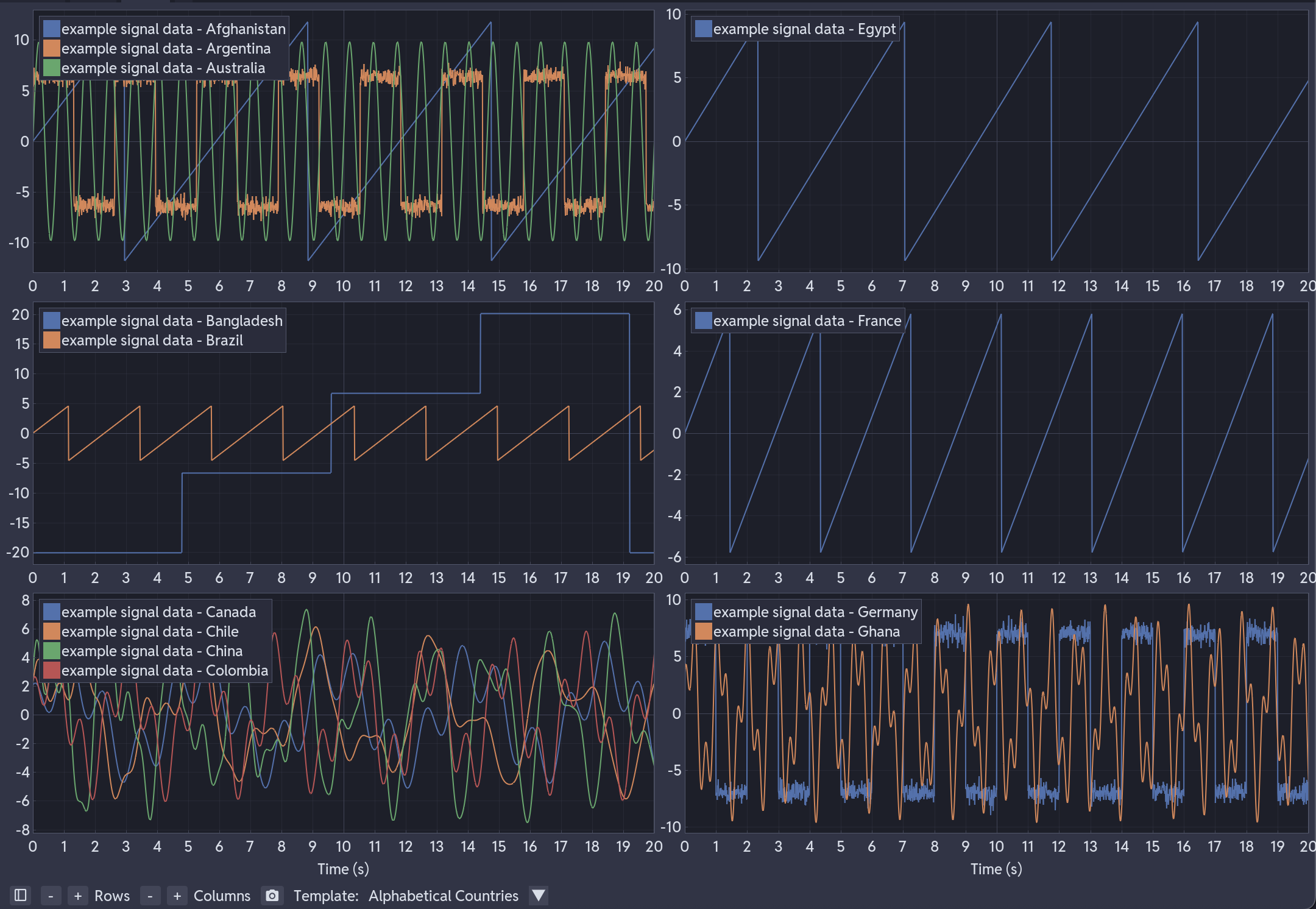
All subplots share the same X-axis range. Zooming or panning in one subplot updates all others, keeping time-aligned signals in sync. Each subplot has its own independent Y-axis.
Plot Tabs
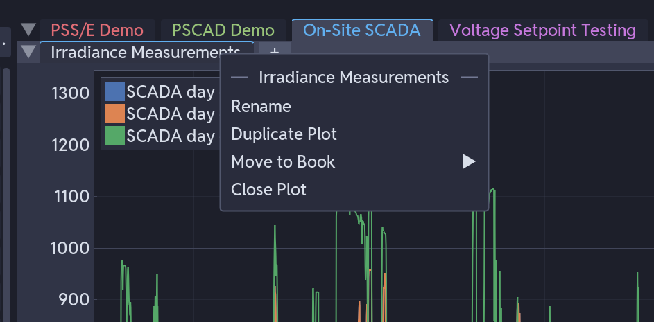
Click + to create a plot tab. Each tab has its own grid, series and settings, so you can keep one tab for voltages and another for currents. Right-click a tab to rename, duplicate or close it, or move it to another book. See User Interface.
Adding Series to a Plot
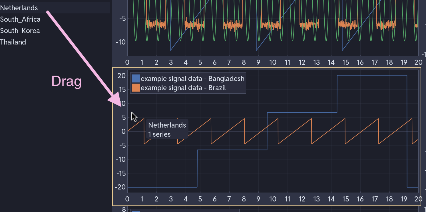
From the sidebar: select the series, using Ctrl+click for several, then drag them onto a subplot. Colours are assigned automatically from a 20-colour palette.
With a template: load a template, then drag a file header from the sidebar onto the plot area. The template's patterns decide which subplot each series lands in. See Templating System.
Between subplots: drag a series from one subplot's legend to another. Its transformations move with it.
Navigation
| Action | Effect |
|---|---|
| Mouse wheel | Zoom in and out |
| Left mouse + drag | Pan |
| Hover axis + scroll | Lock the opposite axis while zooming |
| Right-click | Context menu |
| Right-click + drag | Zoom rectangle |
| Ctrl+click + drag | Query rectangle |
| Middle mouse + drag | Query rectangle |
| Drag series from sidebar | Add the series to a subplot |
Zoom and pan are synchronised across subplots on the X-axis only; each subplot keeps its own Y-axis range.
Legend
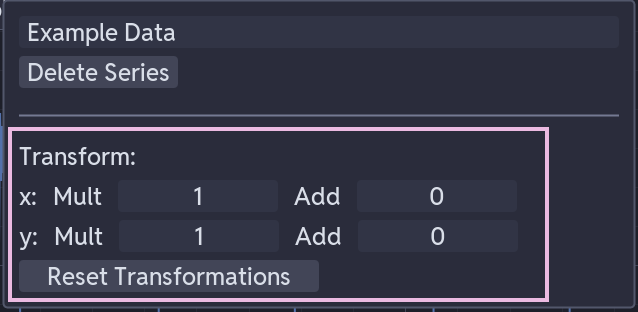
Click a legend label to hide or show that series. Right-click the entry for rename, transform, confidence band, series type, axis and reorder controls. See Data Transformations for the full list.
Right-Click Menu
Right-click in any subplot to access:
| Option | What it does |
|---|---|
| Add Annotations | Add a horizontal line, vertical line, linked vertical line or text label at the cursor |
| Analysis Module | Attach Rise & Settling Time or FFT Analysis to the subplot, or set it back to None |
| Edit Title | Set the subplot title |
| Edit Y-Axis Label / Edit Second Y-Axis Label | Set the axis label. The second Y-axis option only appears once a series is plotted on it |
| Show Legend | Show or hide the subplot's legend |
Right-click a series in the legend for confidence bands, renaming, transforms and deletion. See Legend above.
Confidence Bands
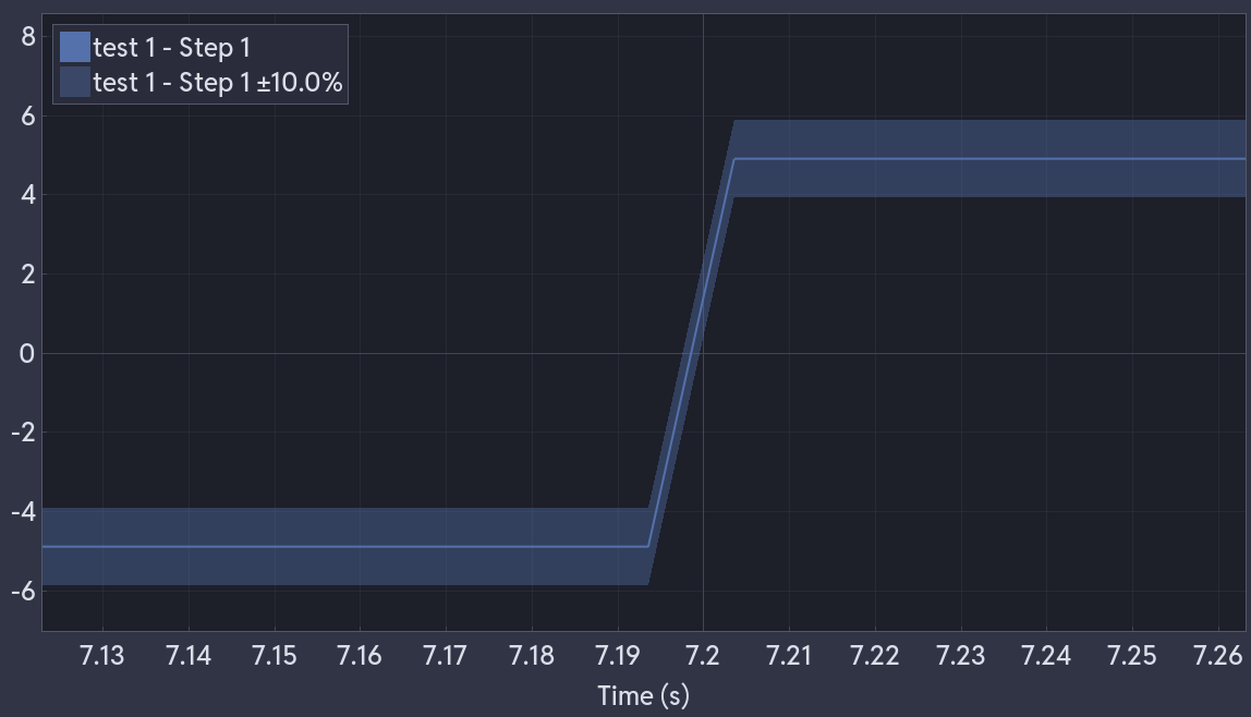
Right-click a series in the legend → Add Confidence Band. Cute Plot shades a percentage tolerance band around it, so you can see at a glance whether the signal stays within limits.
Analysis Modules
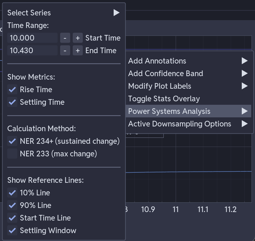
Right-click an empty part of a subplot (not on a series or the legend) to open the plot menu, then choose Analysis Module to attach one of:
- Rise & Settling Time - NER 233 or NER 234+ rise and settling times, with optional 10%, 90%, start-time and settling-window reference lines drawn on the plot
- FFT Analysis - the dominant spectral peaks for a series, with an optional small floating spectrum plot
Picking None removes the module. Only one module is active per subplot at a time, so choosing a different type replaces the one that's there.
The Analysis Window
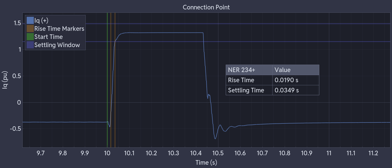
Adding a module draws two labelled vertical lines, Start and End, marking the region it analyses. Drag either line on the plot to move it. A tag on the axis shows its current time as you drag, and the results update once you release it.
For an exact position, right-click a line for:
- an input box to type the exact start or end time
- Analysis Settings - jump straight back into the module's settings
- Hide Window Lines - hide both lines without removing the module
The same start/end values can also be set from the module's settings, reached by right-clicking the subplot again or right-clicking the results table.
The Results Table
A floating table shows the calculated values, and can be dragged to reposition it. Show Table, in the module's settings, hides or shows it independently of the window lines.
See Query & Analysis Tools for how the NER and FFT calculations work.
Screenshots
Click the screenshot button at the bottom of the plot area to capture the current view as a PNG. The image is saved to the application's screenshot folder under a timestamped filename and copied to the clipboard.
Time-Series Mode
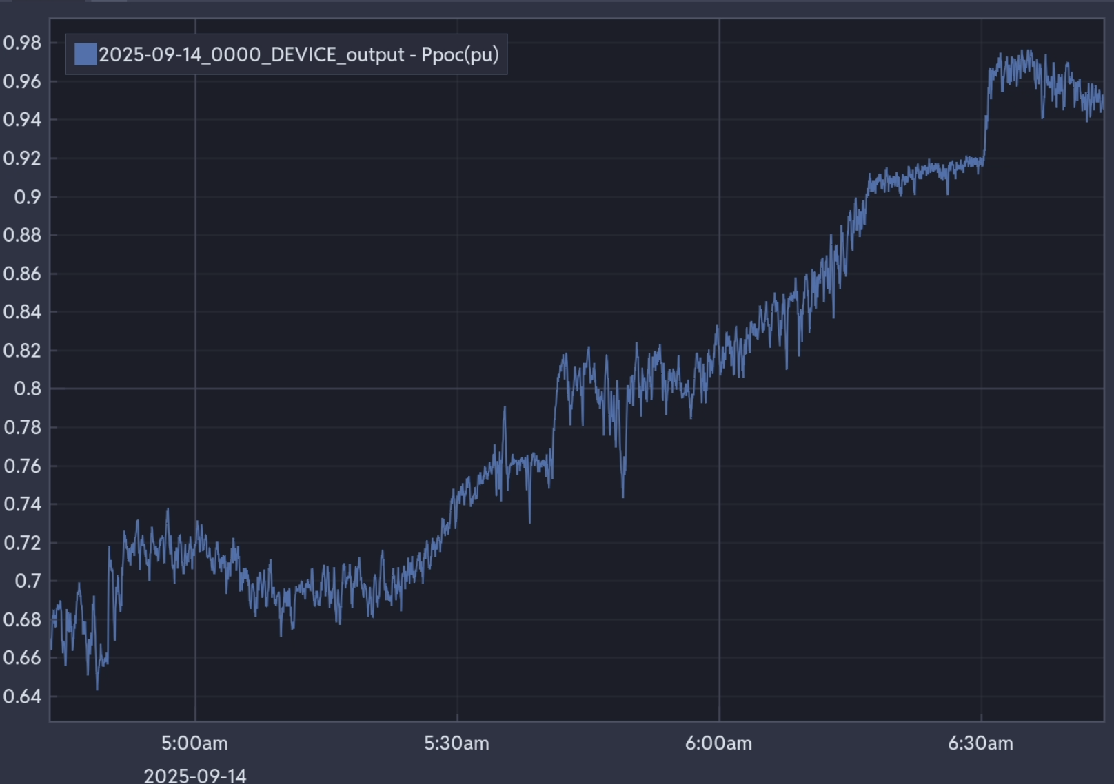
Dropping a timestamped series onto an empty plot switches it into time-series mode, and the X-axis then shows clock times, with the date below. Series without timestamps that are dropped onto the same plot are offset to line up with that timeline.
Performance
Cute Plot downsamples at several levels of detail to keep large datasets responsive. Peaks and troughs survive downsampling, so no spike or dip is hidden at any zoom level